32 Time-Indexed Regression: From Flexible Models to Trend
32.1 Time-Indexed Regression: From Flexible Models to Trend
The previous lectures focused on choosing predictors and flexible mean functions. We now turn to a different complication: observations collected through time.
In ordinary regression we usually write \[y_i = \beta_0 + \beta_1 x_{i1} + \cdots + \beta_p x_{ip} + \varepsilon_i,\] and assume that the errors \(\varepsilon_i\) are independent. For the moment we keep that assumption and focus on how regular time patterns can be represented in the mean of the model.
By the end of this lecture, students should be able to:
- Explain why time-indexed data often need explicit time predictors.
- Use indicator variables to represent simple seasonal effects.
- Distinguish mean structure in time from residual dependence over time.
- Recognise the same modelling idea in both a classical and a modern dataset.
32.2 Ski Sales: A First Seasonal Example
Often time series show a regular seasonal pattern. One simple way to handle this in a regression model is to create indicator variables for the most obvious seasonal effect.
We begin with quarterly ski equipment sales and personal disposable income (PDI). Sales increase over time as income increases, but there also appears to be a seasonal pattern.
| Year | Quarter | Sales | PDI | Time |
|---|---|---|---|---|
| 1964 | 1 | 37.0 | 109 | 1964.00 |
| 1964 | 2 | 33.5 | 115 | 1964.25 |
| 1964 | 3 | 30.8 | 113 | 1964.50 |
| 1964 | 4 | 37.9 | 116 | 1964.75 |
| 1965 | 1 | 37.4 | 118 | 1965.00 |
| 1965 | 2 | 31.6 | 120 | 1965.25 |
32.2.1 Fitting Sales on Income Alone
ski_plot <- SkiSales |>
    mutate(Quarter = factor(Quarter)) |>
    ggplot(aes(x = PDI, y = Sales)) + geom_point(aes(shape = Quarter, colour = Quarter),
    size = 2.5) + labs(title = "Ski sales rise with disposable income")

SkiSales_lm1 <- lm(Sales ~ PDI, data = SkiSales)

ski_resid_plot <- SkiSales |>
    mutate(Quarter = factor(Quarter), Residuals = resid(SkiSales_lm1)) |>
    ggplot(aes(x = PDI, y = Residuals)) + geom_point(aes(shape = Quarter, colour = Quarter),
    size = 2.5) + geom_hline(yintercept = 0, linetype = 2, colour = "blue") + labs(title = "Residuals still show a seasonal pattern")

(ski_plot | ski_resid_plot) + plot_layout(guides = "collect") & theme(legend.position = "bottom")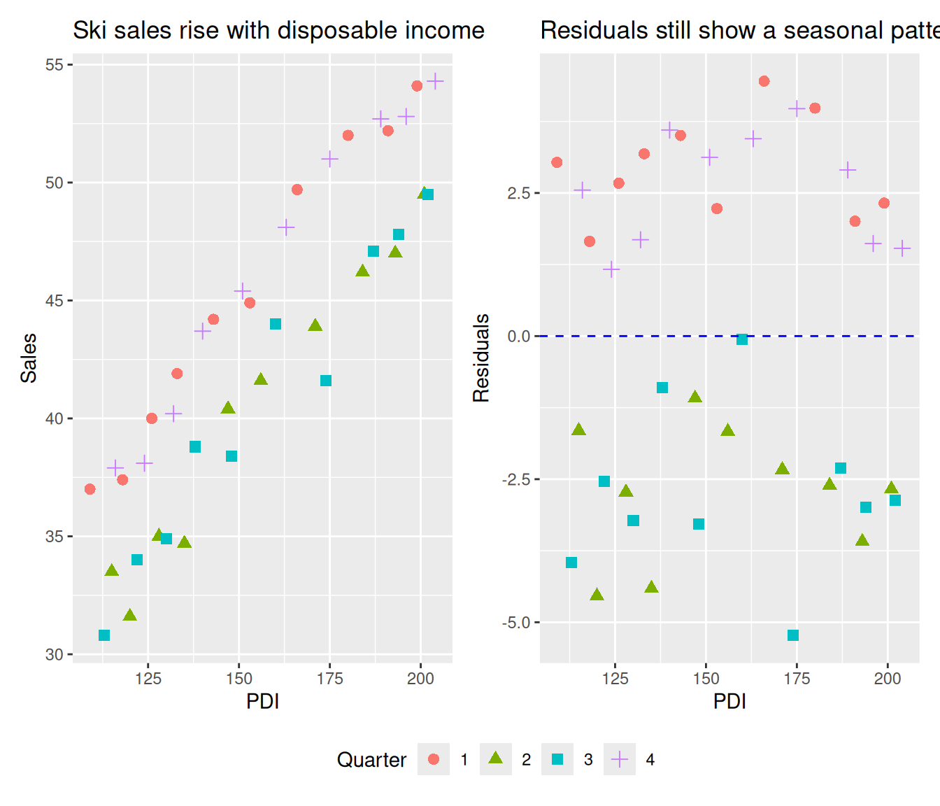
The residuals tend to be positive in quarters 1 and 4, and negative in quarters 2 and 3. That suggests winter sales are systematically higher than summer sales, even after allowing for income.
32.2.2 A Winter Indicator
SkiSales <- SkiSales |>
    mutate(Winter = as.numeric(Quarter == 1 | Quarter == 4))

SkiSales_lm2 <- lm(Sales ~ PDI + Winter, data = SkiSales)
summary(SkiSales_lm2)
Call:
lm(formula = Sales ~ PDI + Winter, data = SkiSales)

Residuals:
     Min       1Q   Median       3Q      Max
-2.51118 -0.78640  0.02632  0.72842  2.67040

Coefficients:
            Estimate Std. Error t value Pr(>|t|)
(Intercept) 9.540202   0.974825   9.787 8.23e-12 ***
PDI         0.198684   0.006036  32.915  < 2e-16 ***
Winter      5.464342   0.359682  15.192  < 2e-16 ***
---
Signif. codes:  0 '***' 0.001 '**' 0.01 '*' 0.05 '.' 0.1 ' ' 1

Residual standard error: 1.137 on 37 degrees of freedom
Multiple R-squared:  0.9724,    Adjusted R-squared:  0.971
F-statistic: 652.9 on 2 and 37 DF, p-value: < 2.2e-16plot(SkiSales_lm2$residuals ~ PDI, data = SkiSales, pch = SkiSales$Quarter, col = SkiSales$Quarter,
xlab = "PDI", ylab = "Residuals")
abline(h = 0, lty = 2)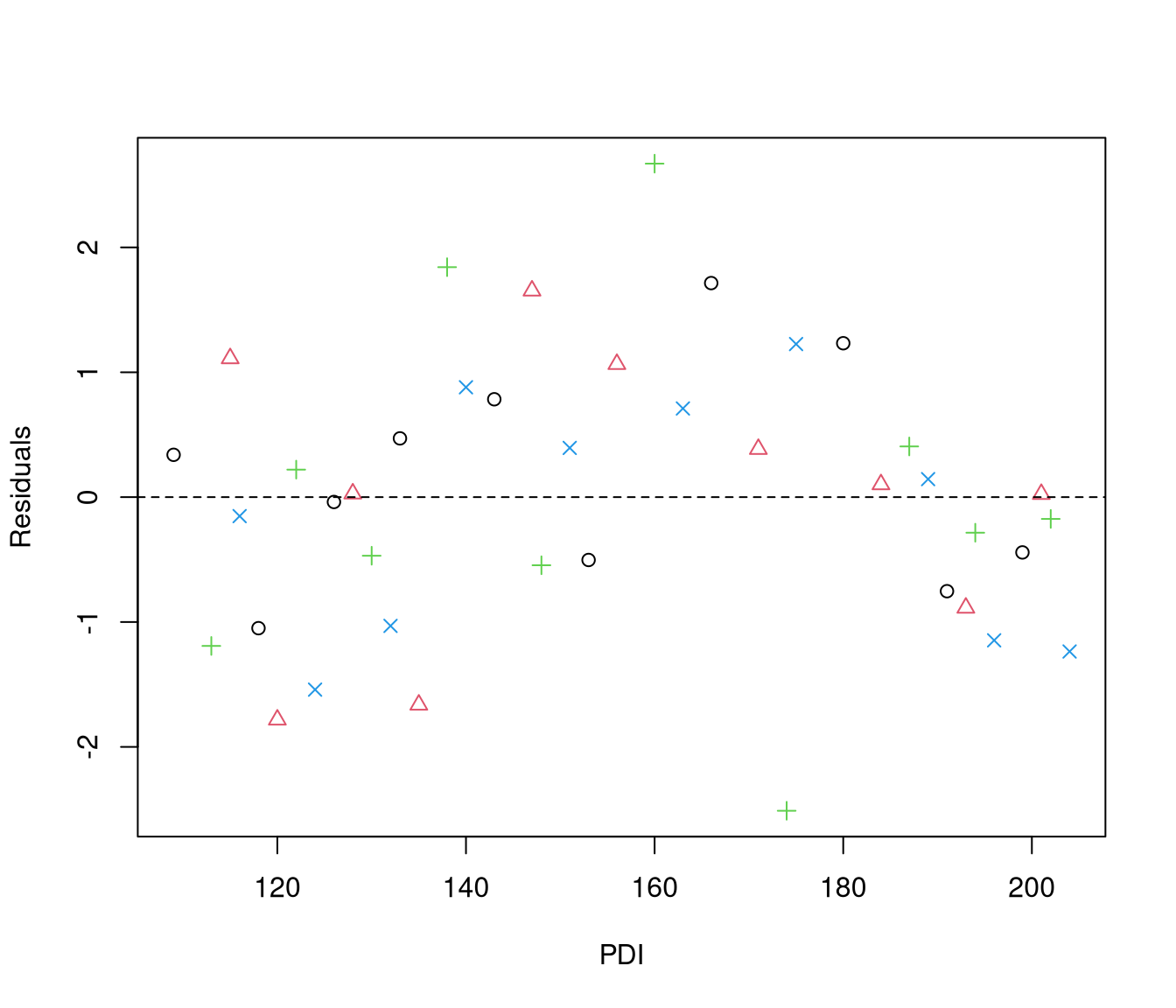
The winter indicator is strongly associated with sales, and the residuals look much less structured by quarter.
32.2.3 Is Winter Enough?
We can still ask whether there is any extra difference between the first and second half of winter, or between the two summer quarters.
SkiSales <- SkiSales |>
    mutate(Q4 = as.numeric(Quarter == 4), Q2 = as.numeric(Quarter == 2))

SkiSales_lm3 <- lm(Sales ~ PDI + Winter + Q4 + Q2, data = SkiSales)
summary(SkiSales_lm3)
Call:
lm(formula = Sales ~ PDI + Winter + Q4 + Q2, data = SkiSales)

Residuals:
     Min       1Q   Median       3Q      Max
-2.51356 -0.86028  0.03654  0.67965  2.67306

Coefficients:
             Estimate Std. Error t value Pr(>|t|)
(Intercept)  9.479913   1.037830   9.134 8.58e-11 ***
PDI          0.199044   0.006190  32.155  < 2e-16 ***
Winter       5.645220   0.520508  10.846 9.72e-13 ***
Q4          -0.353116   0.521495  -0.677    0.503
Q2           0.008279   0.519706   0.016    0.987
---
Signif. codes:  0 '***' 0.001 '**' 0.01 '*' 0.05 '.' 0.1 ' ' 1

Residual standard error: 1.162 on 35 degrees of freedom
Multiple R-squared:  0.9728,    Adjusted R-squared:  0.9697
F-statistic: 313 on 4 and 35 DF, p-value: < 2.2e-16Analysis of Variance Table
Model 1: Sales ~ PDI + Winter
Model 2: Sales ~ PDI + Winter + Q4 + Q2
Res.Df RSS Df Sum of Sq F Pr(>F)
1 37 47.864
2 35 47.245 2 0.61919 0.2294 0.7962For these data, the simple winter indicator captures the main seasonal effect well enough. This is our first example of time-indexed regression: the mean changes with both income and time-of-year.
32.3 A Modern Comparison: Daily Seoul Bike Demand
The same idea appears in a richer modern dataset. Here the response is daily bike demand, and time enters the model through a progression of increasingly flexible terms.
seoul_daily <- read_csv("../data/seoul_bike_daily.csv", show_col_types = FALSE)
seoul_daily |>
    head() |>
kable()| date | day_index | rented_bike_count | mean_temperature | mean_humidity | mean_wind_speed | mean_visibility | mean_dew_point_temperature | total_solar_radiation | total_rainfall | total_snowfall | season | holiday_any | functioning_day_all |
|---|---|---|---|---|---|---|---|---|---|---|---|---|---|
| 2017-12-01 | 1 | 9539 | -2.4541667 | 45.87500 | 1.5375000 | 1870.750 | -13.545833 | 5.97 | 0.0 | 0.0 | Winter | no | yes |
| 2017-12-02 | 2 | 8523 | 1.3250000 | 61.95833 | 1.7125000 | 1471.083 | -5.716667 | 6.33 | 0.0 | 0.0 | Winter | no | yes |
| 2017-12-03 | 3 | 7222 | 4.8750000 | 81.54167 | 1.6125000 | 455.750 | 1.883333 | 3.01 | 4.0 | 0.0 | Winter | no | yes |
| 2017-12-04 | 4 | 8729 | -0.3041667 | 52.50000 | 3.4500000 | 1362.833 | -9.925000 | 6.79 | 0.1 | 0.0 | Winter | no | yes |
| 2017-12-05 | 5 | 8307 | -4.4583333 | 36.41667 | 1.1083333 | 1959.458 | -17.425000 | 0.86 | 0.0 | 0.0 | Winter | no | yes |
| 2017-12-06 | 6 | 6669 | 0.0458333 | 70.79167 | 0.6958333 | 1186.875 | -5.187500 | 6.14 | 1.3 | 8.6 | Winter | no | yes |
32.3.1 Plot 1: Raw Data with Non-Functioning Days Highlighted
Before modelling, check whether every observation represents the process you think it does. Days when the bike system was not functioning all day are not ordinary demand observations — they are system-availability failures.
seoul_daily |>
    mutate(non_functioning = functioning_day_all != "yes") |>
    ggplot(aes(x = date, y = rented_bike_count)) + geom_line(colour = "grey50") +
    geom_point(data = seoul_daily |>
        filter(functioning_day_all != "yes"), colour = "red", size = 2) + labs(x = "Date",
    y = "Daily rented bike count", title = "Non-functioning days (red) are not ordinary demand")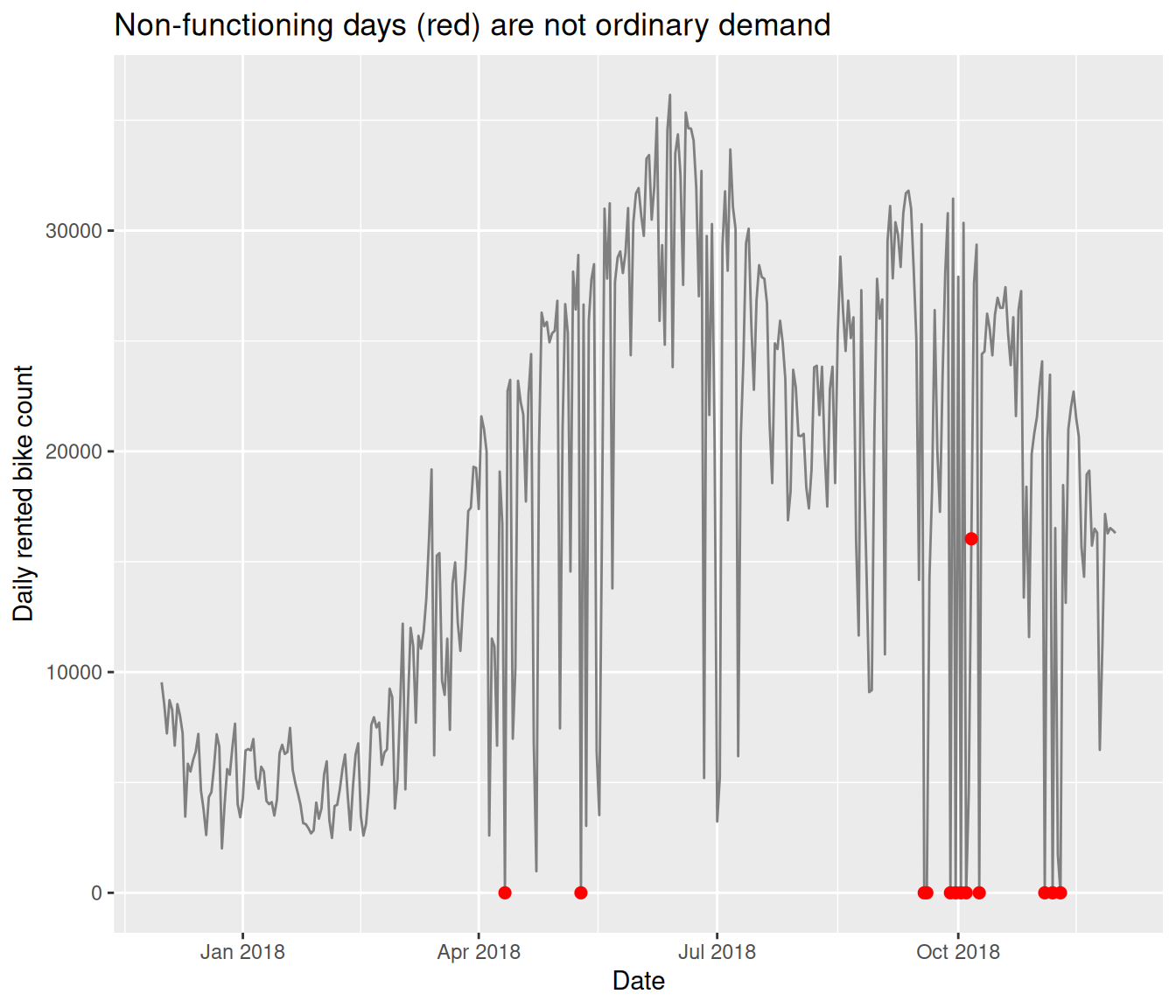
The teaching message: data cleaning is part of model specification. If the system was not functioning all day, the response is not measuring normal daily demand. This motivates filtering.
32.3.2 Plot 2: Clean Time Series After Filtering
seoul_daily_clean <- seoul_daily |>
    filter(functioning_day_all == "yes")

ggplot(seoul_daily_clean, aes(x = date, y = rented_bike_count)) + geom_line() + labs(x = "Date",
    y = "Daily rented bike count", title = "Daily bike demand on functioning days only")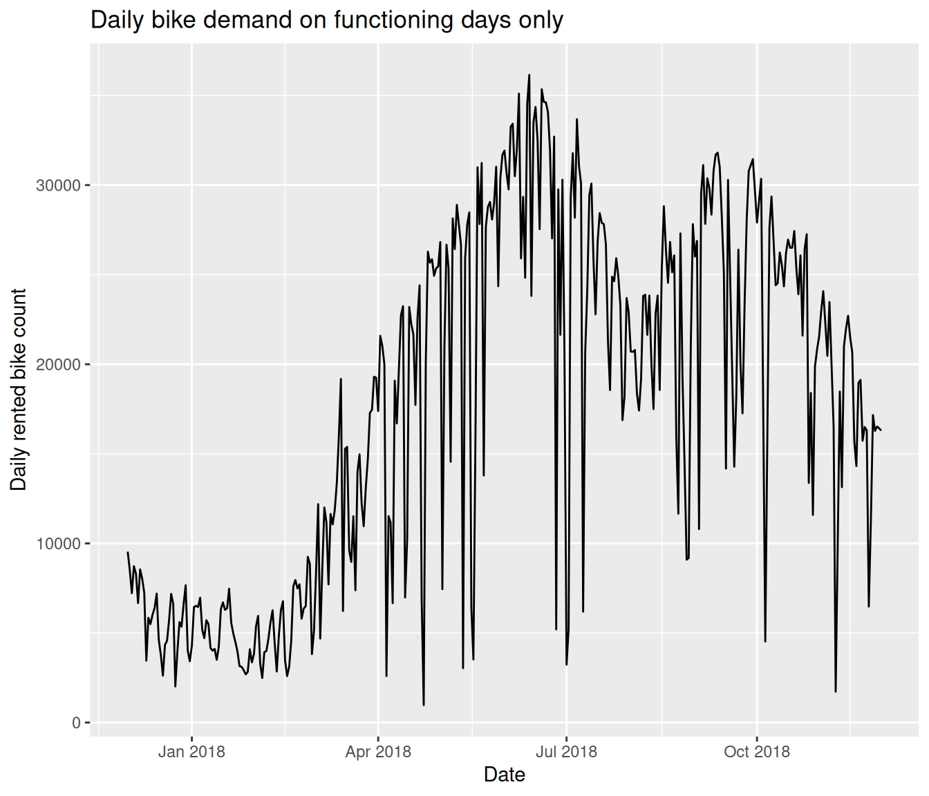
Once structural outage days are removed, the time series still has clear structure. Three features should be visible: a broad upward or changing time pattern, a strong annual seasonal cycle, and short-term noise around that pattern. Observations are ordered, and that order matters — the data are not just independent rows in a spreadsheet.
32.3.3 Plot 3: Trend-Only Model
A linear trend captures the broad direction but ignores the seasonal pattern entirely.
seoul_trend <- lm(rented_bike_count ~ day_index, data = seoul_daily_clean)

seoul_daily_clean |>
    ggplot(aes(x = date, y = rented_bike_count)) + geom_line(colour = "grey50") +
    geom_line(aes(y = fitted(seoul_trend)), colour = "blue", linewidth = 1) + labs(x = "Date",
    y = "Daily rented bike count", title = "Trend-only model misses the seasonal pattern")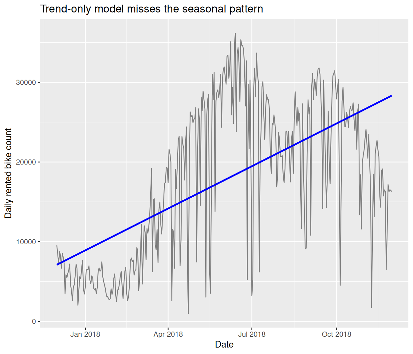
The fitted line rises slowly, but the data oscillate around it in a regular annual cycle. The trend-only model systematically underpredicts in some seasons and overpredicts in others — exactly the same pattern we saw in the ski sales residuals.
32.3.4 Plot 4: Adding a Fourier Seasonal Term
A pair of sine and cosine terms at the annual frequency captures a smooth seasonal cycle without needing a separate indicator for each month.
seoul_daily_clean <- seoul_daily_clean |>
    mutate(S1 = sin(2 * pi * day_index/365), C1 = cos(2 * pi * day_index/365))

seoul_fourier <- lm(rented_bike_count ~ day_index + S1 + C1, data = seoul_daily_clean)
summary(seoul_fourier)
Call:
lm(formula = rented_bike_count ~ day_index + S1 + C1, data = seoul_daily_clean)

Residuals:
     Min       1Q   Median       3Q      Max
-23326.8  -2884.9    664.6   4330.8  10705.3

Coefficients:
            Estimate Std. Error t value Pr(>|t|)
(Intercept) 11292.21     930.79  12.132  < 2e-16 ***
day_index      34.54       4.82   7.166 4.64e-12 ***
S1          -4292.64     714.83  -6.005 4.81e-09 ***
C1          -6652.94     450.80 -14.758  < 2e-16 ***
---
Signif. codes:  0 '***' 0.001 '**' 0.01 '*' 0.05 '.' 0.1 ' ' 1

Residual standard error: 5988 on 348 degrees of freedom
Multiple R-squared:  0.641, Adjusted R-squared:  0.6379
F-statistic: 207.1 on 3 and 348 DF,  p-value: < 2.2e-16
seoul_daily_clean |>
ggplot(aes(x = date, y = rented_bike_count)) + geom_line(colour = "grey50") +
geom_line(aes(y = fitted(seoul_fourier)), colour = "red", linewidth = 1) + labs(x = "Date",
y = "Daily rented bike count", title = "Trend + Fourier seasonal model captures the annual cycle")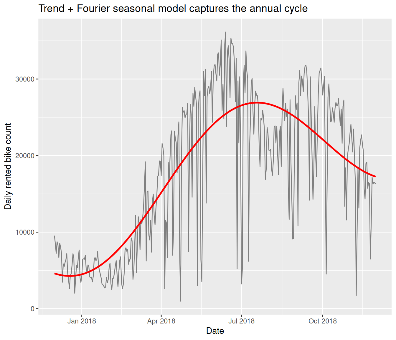
The Fourier pair adds only two parameters but visibly tracks the annual rise and fall. The model now follows the data through summer peaks and winter troughs.
32.3.5 Plot 5: Comparing Trend Only and Trend + Fourier
Overlaying both fitted lines on the same axes makes the improvement clear.
seoul_daily_clean |>
    ggplot(aes(x = date, y = rented_bike_count)) + geom_line(colour = "grey50") +
    geom_line(aes(y = fitted(seoul_trend), colour = "Trend only"), linewidth = 1) +
    geom_line(aes(y = fitted(seoul_fourier), colour = "Trend + Fourier"), linewidth = 1) +
    scale_colour_manual(values = c(`Trend only` = "blue", `Trend + Fourier` = "red")) +
    labs(x = "Date", y = "Daily rented bike count", colour = "Model", title = "Adding a Fourier seasonal term dramatically improves the fit")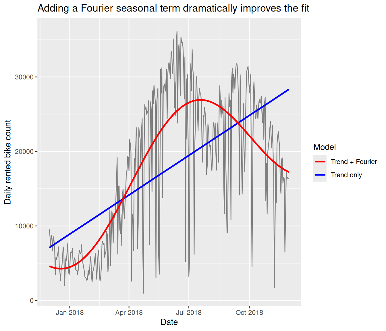
The logic is the same as in the ski example. We are still using ordinary regression, but one predictor records where the observation sits in time and a pair of trigonometric terms describes the smooth annual cycle.
32.4 Mean Structure First, Error Dependence Later
In both examples we used time predictors to describe the mean response: \[E(Y_t) = \beta_0 + \beta_1 t + \beta_2 z_t + \cdots.\]
That is different from saying the errors are autocorrelated. A model can capture clear time structure in the mean and still leave dependent residuals behind. The next lecture develops richer seasonal terms, and later lectures return to the question of autocorrelation in the errors.