30 Weighted regression
30.1 Introduction
The key idea in this topic is that not all datapoints in the dataset need have the same information value. Some data rows may contain very precise data, while data in the other rows may be less precise.
We therefore adjust our regression analysis to give more “weight” to those datapoints which are more reliable or informative.
- Weighting by sample size.
- Interpretation of output.
- Weighting to counter heteroscedasticity.
30.2 Weighting by Sample Size
The CPS5 dataset is famous in econometrics, referred to often in the book “Introductory Econometrics” by Goldberger.
The dataset has individual-level data on 528 employees EDucation level, whether or not they are in the SOuth of the United States, BL=whether the person was non-white and non-Hispanic 1, otherwise 0, HP= whether or not the person was Hispanic, whether or not the employee was FEmale, years of work EXperience, MS= marital status (1=married, 0 not), whether or not they are members of a UNion, and WG=hourly wage.
Goldberger begins his text by calculating the average WG value for individuals at the various levels of education. (6 years to 18 years of education). Note that most people had 12, 14 or 16 years of education, corresponding to high-school graduates, college graduates and university graduates respectively.
Goldberger then regresses the average WG on ED.
30.2.1 CPS5 grouped data
   EDgroup  AvWage  SEMean   StDev   N
1        6  4.4567 0.79805 1.38226   3
2        7  5.7700 0.83690 1.87136   5
3        8  5.9787 0.62779 2.43142  15
4        9  7.3317 1.29904 4.50000  12
5       10  7.3182 0.64444 2.65711  17
6       11  6.5844 0.64084 3.32992  27
7       12  7.8182 0.25206 3.72159 218
8       13  7.8351 0.66765 4.06114  37
9       14 11.0223 0.92157 6.89643  56
10      15 10.6738 1.39739 5.03837  13
11      16 10.8361 0.63981 5.35304  70
12      17 13.6150 1.42417 6.97699  24
13      18 13.5310 1.09328 6.08715  31
30.2.2 Grouped data scatterplot
ggplot(data = CPS5grouped, mapping = aes(x = EDgroup, y = AvWage)) + geom_point(mapping = aes(size = N)) +
    geom_smooth(method = "lm") + labs(x = "Education (hours)", y = "Average wage ($)")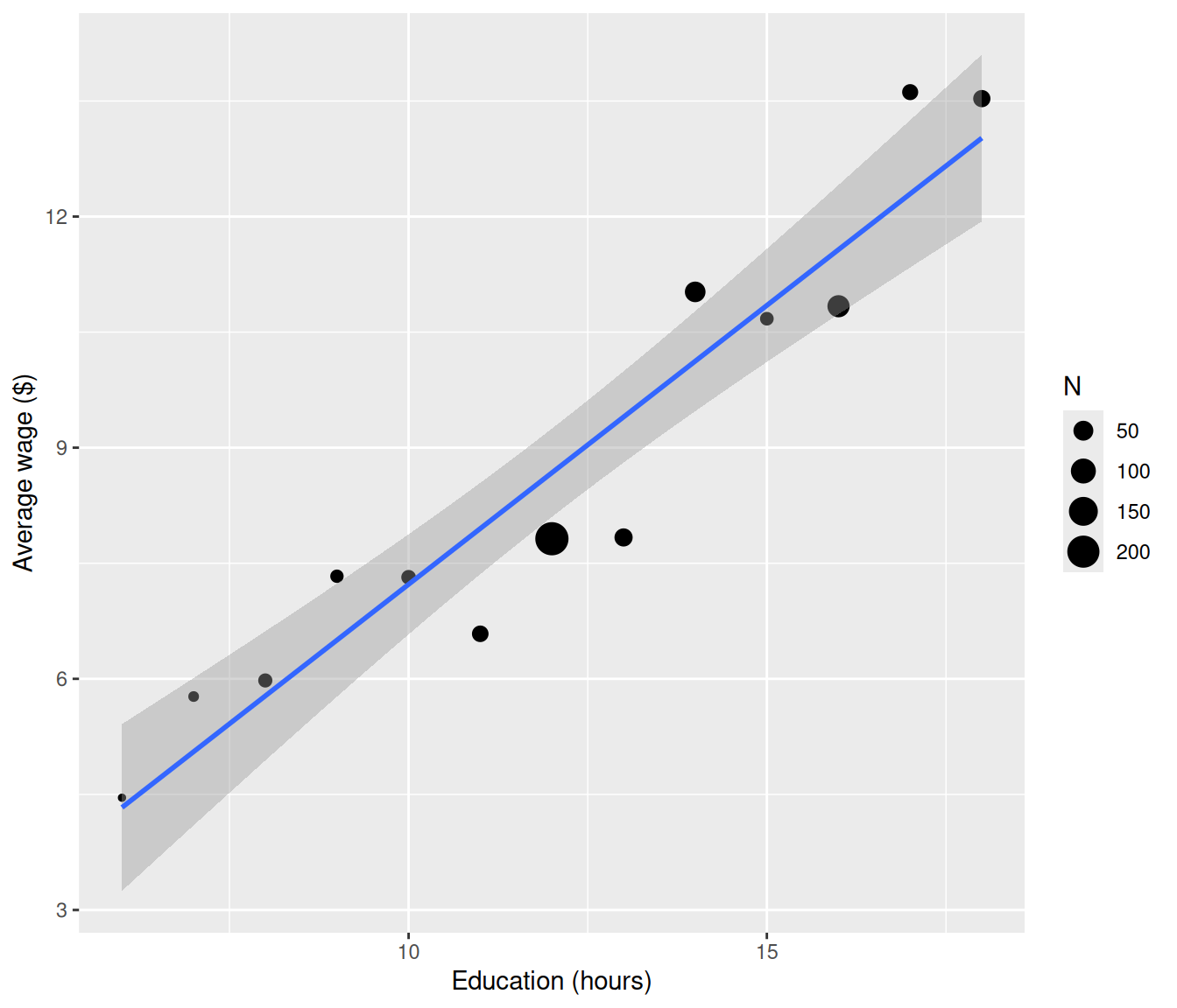
30.2.3 Grouped regression summary
The data appears to be quite close to the line, which often happens when we have data which have been averaged. The regression suggests we have a high \(R^2 >0.9\).
Call:
lm(formula = AvWage ~ EDgroup, data = CPS5grouped)

Residuals:
    Min      1Q  Median      3Q     Max
-1.5637 -0.7350  0.1266  0.7158  1.3198

Coefficients:
            Estimate Std. Error t value Pr(>|t|)
(Intercept) -0.01445    0.87462  -0.017    0.987
EDgroup      0.72410    0.06958  10.406 4.96e-07 ***
---
Signif. codes:  0 '***' 0.001 '**' 0.01 '*' 0.05 '.' 0.1 ' ' 1

Residual standard error: 0.9387 on 11 degrees of freedom
Multiple R-squared:  0.9078,    Adjusted R-squared:  0.8994
F-statistic: 108.3 on 1 and 11 DF,  p-value: 4.958e-07
30.2.4 The problem with equal weighting
However note that the left-hand points represent only a few individuals compared to some of the right-hand points, represented by the size of the circles scaling with the number of individuals \(N\) contributing to the average. We would like the regression line to be closer to those points that represent far more people.
The line is close to the first category (which has only three people in it) and far from the 12, 14, 16-year categories which have the most people. This doesn’t really make sense.
If we use the ungrouped data the relationship between Wage and Education is much weaker in terms of goodness of fit of the model.
30.2.5 Ungrouped CPS5 data
  ED SO BL HP FE MS EX UN   WG
1 10  0  0  0  0  1 27  0  9.0
2 12  0  0  0  0  1 20  0  5.5
3 12  0  0  0  1  0  4  0  3.8
4 12  0  0  0  1  1 29  0 10.5
5 12  0  0  0  0  1 40  1 15.0
6 16  0  0  0  1  1 27  0  9.0
30.2.6 Ungrouped scatterplot
ggplot(data = CPS5, mapping = aes(x = ED, y = WG)) + geom_point() + geom_smooth(method = "lm") +
    labs(x = "Education (years)", y = "Wage ($)")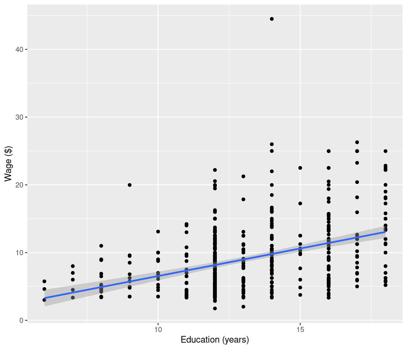
30.2.7 Ungrouped regression summary
Call:
lm(formula = WG ~ ED, data = CPS5)

Residuals:
   Min     1Q Median     3Q    Max
-8.068 -3.163 -0.700  2.289 34.709

Coefficients:
            Estimate Std. Error t value Pr(>|t|)
(Intercept) -1.60468    1.10318  -1.455    0.146
ED           0.81395    0.08281   9.829   <2e-16 ***
---
Signif. codes:  0 '***' 0.001 '**' 0.01 '*' 0.05 '.' 0.1 ' ' 1

Residual standard error: 4.733 on 526 degrees of freedom
Multiple R-squared:  0.1552,    Adjusted R-squared:  0.1536
F-statistic:  96.6 on 1 and 526 DF,  p-value: < 2.2e-16
We see there is an outlier, which could be a typo (decimal point in the wrong place?) However the main focus here is that there is a lot more variation among the individual data than there is among the averaged data, so the \(R^2\) is much lower. Also the regression coefficients have different values.
30.2.8 Why Grouped Regression Results Differ
Formulas not examinable but conclusion is important.
To explain the difference between these two regressions, we consider the regression of \(Y\) vs \(X\) (\(n\) data) and \(\bar Y\) versus \(\bar X\) (where the data have been divided into \(m\) groups - a much smaller number than \(n\).)
In Least Squares we choose \(\beta_0\) and \(\beta_1\) to minimise
\[SS_{error} = \sum^n_{i=1}(y_i - \beta_0- \beta_1 x_i)^2 ~~~~ (1) \]
However the regression for the averages treats all \(m\) groups as being of equal worth:
\[ \sum^m_{j=1}(\bar y_j - \beta_0- \beta_1 \bar x_j)^2 ~~~~~~ (2) \]
That is, the computations will try just as hard to fit a value that arises from a small group of data as a value from a large group.
30.4 Weighted regression in R
To do a weighted regression we have to specify weights in the lm() command. Below we compare the weighted least squares (WLS) estimates from the averaged data to the ungrouped ordinary least squares (OLS) estimates from the raw data.
Call:
lm(formula = AvWage ~ EDgroup, data = CPS5grouped, weights = N)

Weighted Residuals:
   Min     1Q Median     3Q    Max
-6.944 -3.971  2.699  4.151  9.217

Coefficients:
            Estimate Std. Error t value Pr(>|t|)
(Intercept) -1.60468    1.27442  -1.259    0.234
EDgroup      0.81395    0.09567   8.508 3.62e-06 ***
---
Signif. codes:  0 '***' 0.001 '**' 0.01 '*' 0.05 '.' 0.1 ' ' 1

Residual standard error: 5.467 on 11 degrees of freedom
Multiple R-squared:  0.8681,    Adjusted R-squared:  0.8561
F-statistic: 72.39 on 1 and 11 DF,  p-value: 3.621e-06
30.4.0.1 OLS comparison
Call:
lm(formula = WG ~ ED, data = CPS5)

Residuals:
   Min     1Q Median     3Q    Max
-8.068 -3.163 -0.700  2.289 34.709

Coefficients:
            Estimate Std. Error t value Pr(>|t|)
(Intercept) -1.60468    1.10318  -1.455    0.146
ED           0.81395    0.08281   9.829   <2e-16 ***
---
Signif. codes:  0 '***' 0.001 '**' 0.01 '*' 0.05 '.' 0.1 ' ' 1

Residual standard error: 4.733 on 526 degrees of freedom
Multiple R-squared:  0.1552,    Adjusted R-squared:  0.1536
F-statistic:  96.6 on 1 and 526 DF,  p-value: < 2.2e-16
We see that the coefficient estimates are the same, but the standard errors and the \(R^2\) are different.
The following plot shows the averaged data with the unweighted (dashed) and weighted (solid red) lines. The weighted line is closer to where more data are.
30.4.0.2 WLS vs OLS plot
ggplot(data = CPS5grouped, mapping = aes(x = EDgroup, y = AvWage)) + geom_point(mapping = aes(size = N)) +
    geom_smooth(method = "lm", mapping = aes(weight = N), col = "red", se = FALSE) +
    geom_smooth(method = "lm", linetype = "dashed", se = FALSE) + labs(x = "Education (years)",
    y = "Average wage ($)")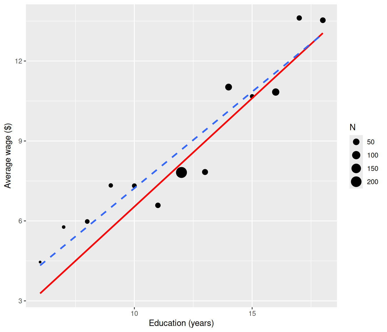
30.5 Residuals for Weighted Regression
Clearly a plot of ordinary residuals could be misleading in the context of weighted least squares. The low weight points on the left are badly fitted and this could make them look like influential outliers.
augment(cps.wls, CPS5grouped) |>
    ggplot(mapping = aes(x = EDgroup, y = .resid)) + geom_point() + geom_hline(yintercept = 0,
    linetype = "dotted") + labs(y = "Simple residuals", x = "Education group (years)")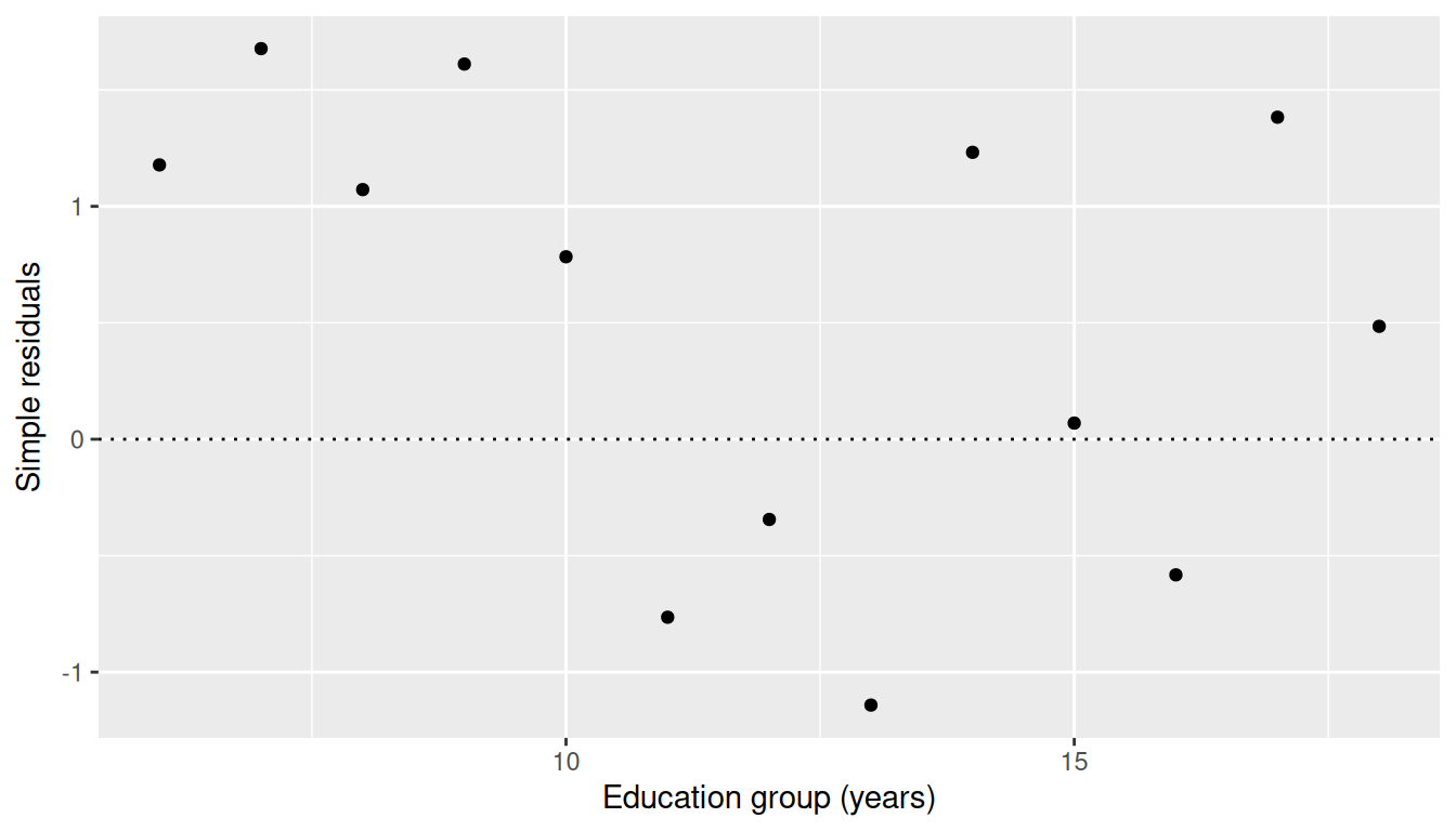
30.5.0.1 Pearson residuals
Instead we use “weighted” or Pearson” Residuals \(r_j = \sqrt{w_j}\varepsilon_j\).
augment(cps.wls, CPS5grouped) |>
    mutate(pearson = .resid * sqrt(N)) |>
    ggplot(mapping = aes(x = EDgroup, y = pearson)) + geom_point() + geom_hline(yintercept = 0,
    linetype = "dotted") + labs(y = "Pearson (weighted) residuals", x = "Education group (years)")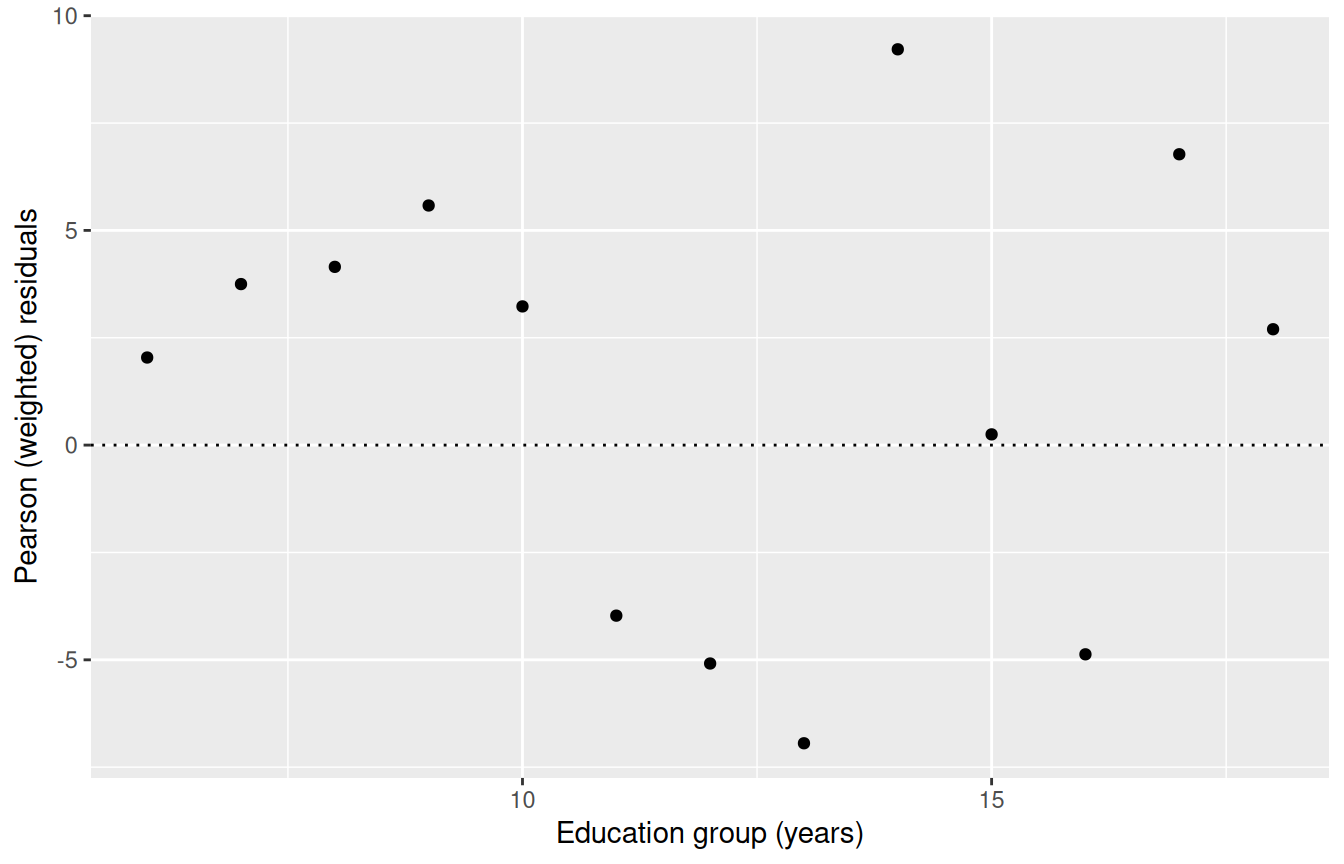
This has given a proper sense of importance to each residual. We see that the low-weight points on the left are not particularly important.
Unfortunately the \(Y\) axis scale is now meaningless so all we can look at is the shape and the relative importance or lack of fit for each point.
30.6 Weighting For Non-Constant Variance
Suppose we have data for which the variance is non-constant. So we want to give more weight to those points which have small variance (or are known more precisely) and give less weight to those points that have bigger variance (or are known less precisely).
This still fits with the idea that Weight represents the amount of information carried by each datapoint.
30.6.1 Supervisors and Workers
The following data is on the number of supervisors \(Y\) (e.g. team leaders) and the number of workers \(X\) at a number of industrial establishments.
The data are from the book by Chatterjee and Price “Regression Analysis by Example”
      X   Y
1   294  30
2   247  32
3   267  37
4   358  44
5   423  47
6   311  49
7   450  56
8   534  62
9   438  68
10  697  78
11  688  80
12  630  84
13  709  88
14  627  97
15  615 100
16  999 109
17 1022 114
18 1015 117
19  700 106
20  850 128
21  980 130
22 1025 160
23 1021  97
24 1200 180
25 1250 112
26 1500 210
27 1650 135
30.6.1.1 Supervisors scatterplot
ggplot(supervisors, mapping = aes(x = X, y = Y)) + geom_point() + geom_smooth(method = "lm") +
    labs(x = "Number of workers (X)", y = "Number of supervisors (Y)")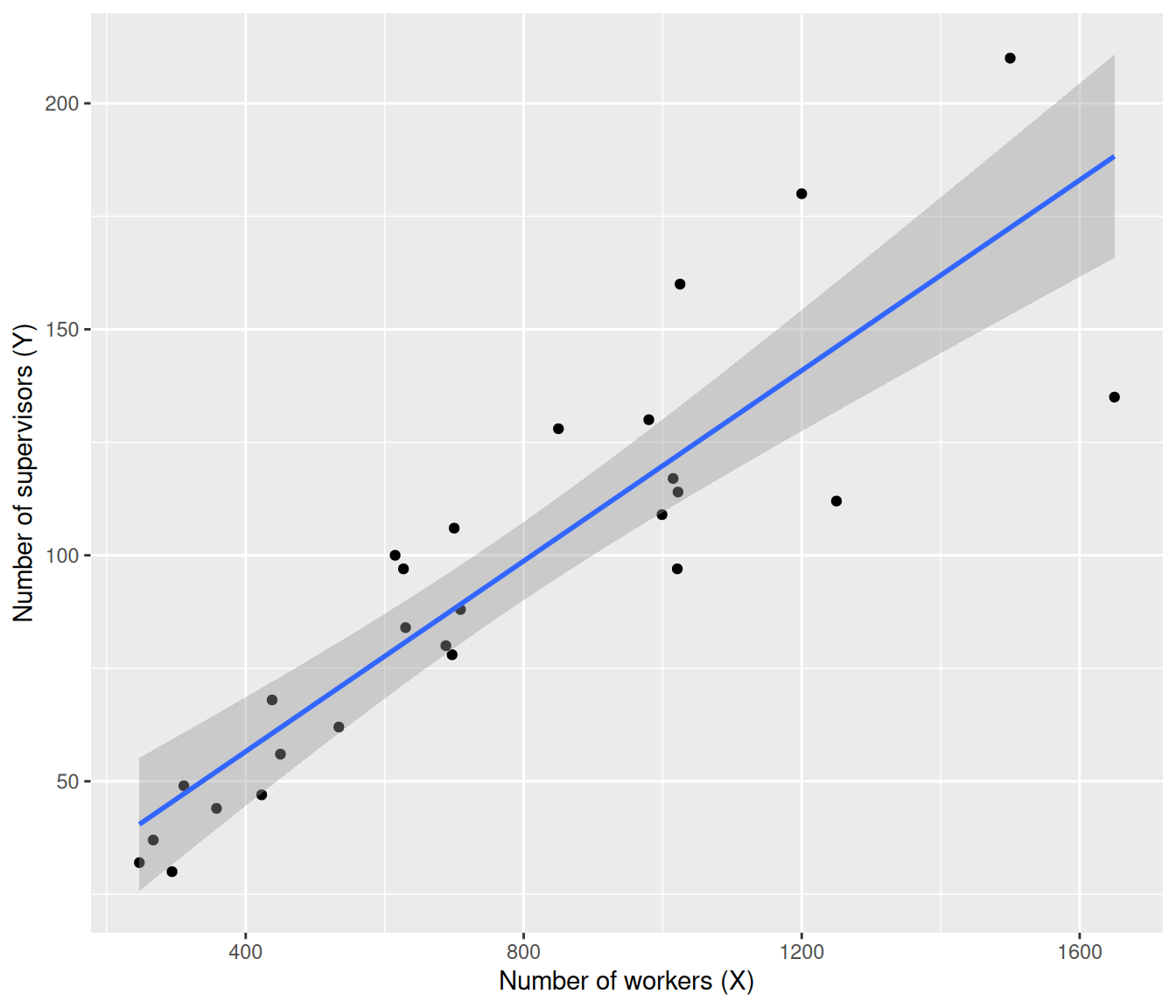
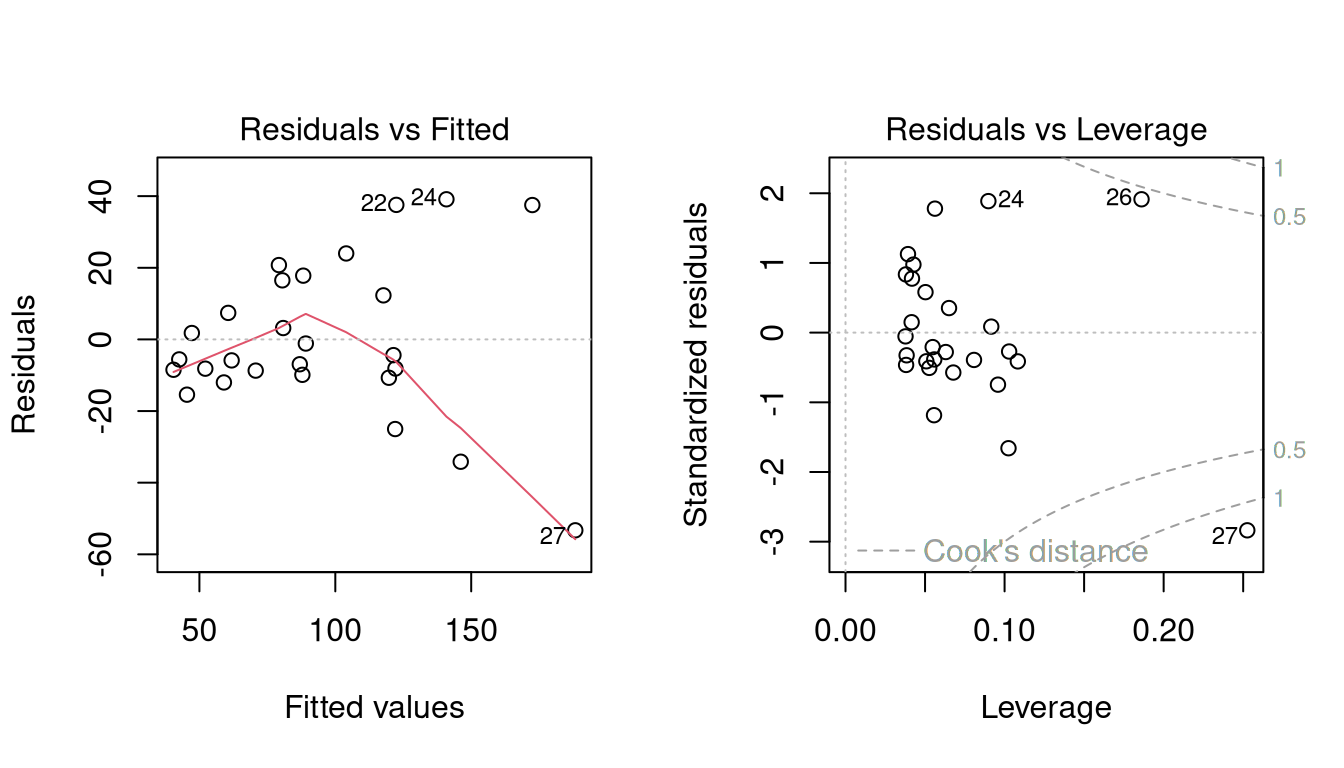
30.6.1.2 OLS residual diagnostics
Note that the line is overshooting the cluster of points on the left.
The residual plots show curvature and heteroscedasticity.
The fourth graph shows a simple linear model is highly influenced by the points at the right, which have very large residuals.
30.6.1.3 Heteroscedasticity pattern
Considering the heteroscedasticity, look at the amount of vertical spread of residuals when \(x\)= 400, 800 and 1600.
As \(X\) doubles, the spread roughly doubles.
This suggests that \(\mbox{sd}(\varepsilon) \propto x\), or in other words \(\sigma = k x\) for some constant \(k\).
Now let us suppose we want to fit a straight-line model \[y_i = \beta_0 + \beta_1 x_i + \varepsilon_i ~ \] We would ordinarily solve this by minimising the \[SS_{error} = \sum( y_i - \beta_0 - \beta_1 x_i)^2\] where the components of the sum (the residuals \(y_i - \beta_0 - \beta_1 x_i\)) have constant standard deviation. Except now the standard deviation is not constant.
But what we could do is divide through by \(x_i\). The model becomes \[\begin{aligned}\frac{y_i}{x_i} &= \frac{\beta_0}{x_i} + \beta_1\frac{x_i}{x_i} + \frac{\varepsilon_i}{x_i}\\Y_i &=\beta_0 X_i + \beta_1 + \eta_i\end{aligned}\] where \(Y_i = \frac{y_i}{x_i}\), \(X_i = \frac{1}{x_i}\) and \(\eta_i = \frac{\varepsilon_i}{x_i}\).
30.6.1.4 Constant variance after transformation
The error term \(\eta_i\) now has constant standard deviation as
\[\mbox{sd}\left( \frac{\varepsilon_i}{x_i}\right) = \frac{ kx_i}{x_i} = k.\]
We now have a linear model with constant variance so can solve by least squares in the usual way.
We could do the transformation ourselves and then just use lm() normally, but another way to look at it is we’re minimising
\[\sum \left(\frac{y_i}{x_i} - \frac{\beta_0}{x_i} - \beta_1 \right)^2 ~~= ~~ \sum \frac{1}{x_i^2}\left(y_i - \beta_0 -\beta_1 x_i \right)^2\]
which is a weighted regression with \(w_i = 1/ x_i^2\). So the task with this transformation is the same as weighted least squares with these weights.
30.6.1.5 WLS for supervisors
Call:
lm(formula = Y ~ X, data = supervisors, weights = 1/X^2)

Weighted Residuals:
      Min        1Q    Median        3Q       Max
-0.041477 -0.013852 -0.004998  0.024671  0.035427

Coefficients:
            Estimate Std. Error t value Pr(>|t|)
(Intercept) 3.803296   4.569745   0.832    0.413
X           0.120990   0.008999  13.445 6.04e-13 ***
---
Signif. codes:  0 '***' 0.001 '**' 0.01 '*' 0.05 '.' 0.1 ' ' 1

Residual standard error: 0.02266 on 25 degrees of freedom
Multiple R-squared:  0.8785,    Adjusted R-squared:  0.8737
F-statistic: 180.8 on 1 and 25 DF,  p-value: 6.044e-13
30.6.1.6 WLS vs OLS supervisors plot
ggplot(data = supervisors, mapping = aes(x = X, y = Y)) + geom_point() + geom_smooth(method = "lm",
    mapping = aes(weight = 1/X^2), col = "red", se = FALSE) + geom_smooth(method = "lm",
    linetype = "dotted", se = FALSE) + labs(x = "Number of workers (X)", y = "Number of supervisors (Y)")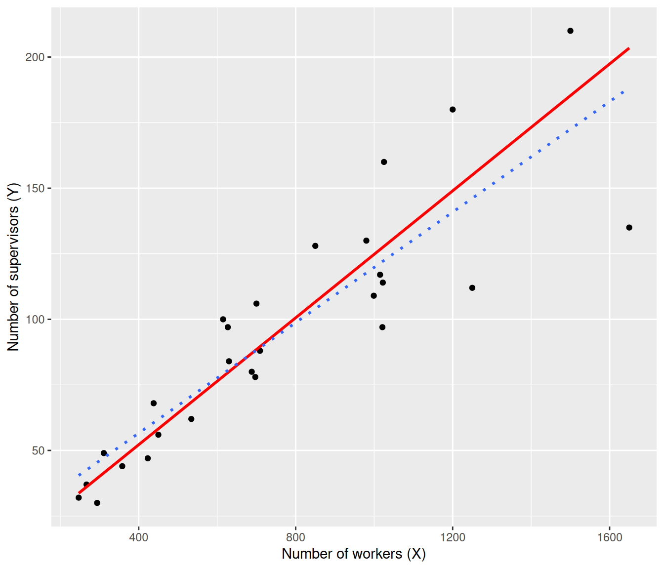
30.6.1.7 Weighted residuals plot
The plot shows that weighted line (red, solid) is now going closer to the data at the left, where the random error is smallest, whereas the OLS line (dotted) overshot the data at left.
The plot of weighted residuals below shows constant variance (with perhaps a little curvature).
augment(sup.wls) |>
    mutate(pearson = .resid/X) |>
    ggplot(mapping = aes(x = X, y = pearson)) + geom_point() + geom_hline(yintercept = 0,
    linetype = "dotted") + labs(y = "Pearson (weighted) residuals", x = "Number of workers (X)")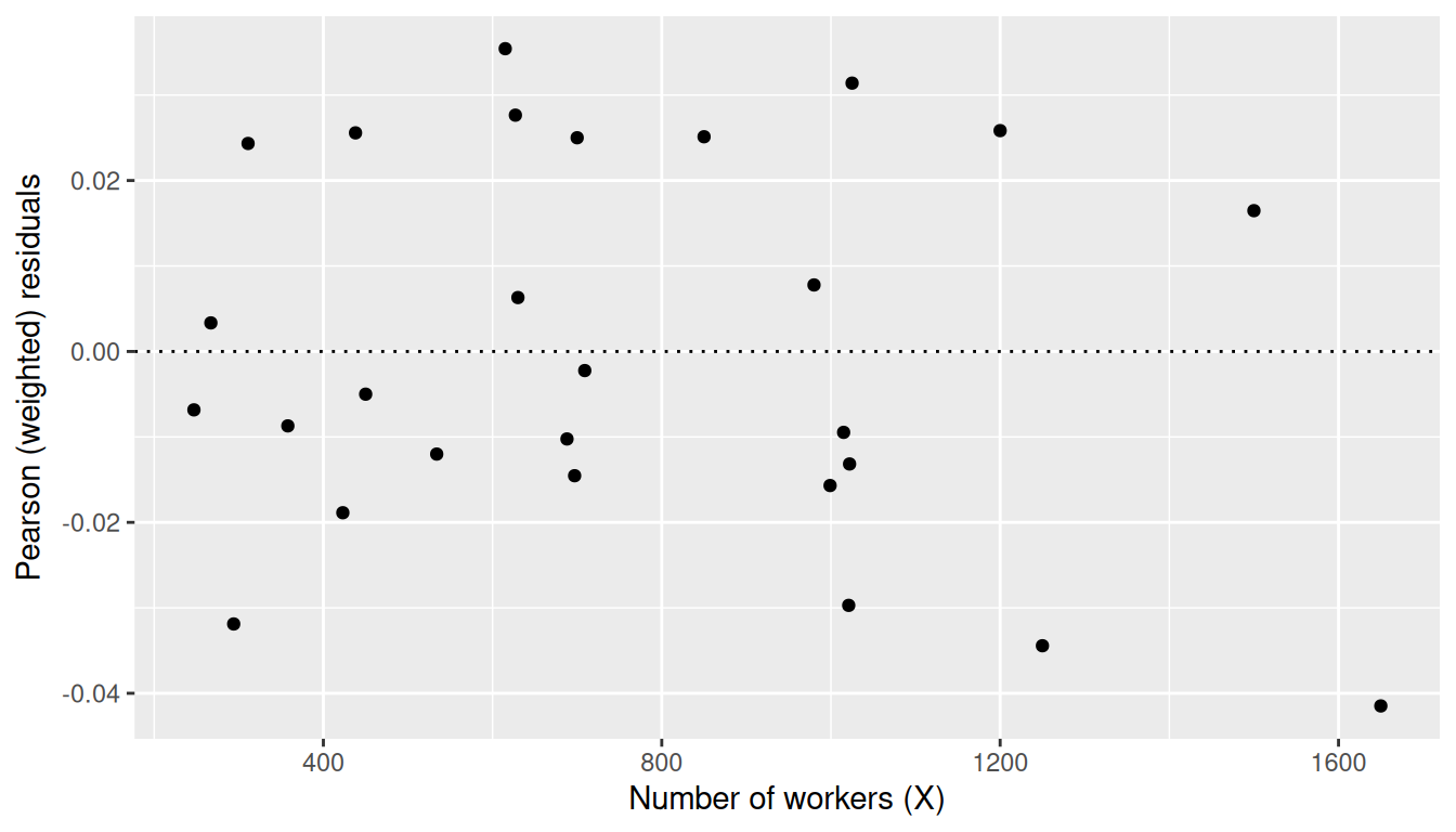
30.7 Basic rule for Weighting
Assume weights \[w_i = \frac{n_i}{\mbox{variance}_i} ~~~~~ (6) \]
where, if \(n\) doesn’t vary between data rows then just replace by \(n=1\), and if the precision of data (1/variance) does not differ between data rows then just drop that term.
30.7.1 Application: Meta Analysis
You may have heard of the field of meta-analysis, which is concerned with combining the results of many small studies in order to get an overall result.
Meta-analysis uses weights of the form (6) to represent the differing amounts and quality of data from the different studies.
30.8 Revisiting the CPS5grouped data
For these data, there was a column of standard deviations (StDev) as well as sample sizes N. So we could use weights \(W_i = N_i/ \mbox{StDev}_i^2\)
CPS5weighted <- CPS5grouped |> mutate(Wt = N/ StDev^2)
cps.wls2 <- lm(AvWage ~ EDgroup, weights=Wt, data=CPS5weighted)
summary(cps.wls2)
Call:
lm(formula = AvWage ~ EDgroup, data = CPS5weighted, weights = Wt)

Weighted Residuals:
    Min      1Q  Median      3Q     Max
-1.4367  0.1153  0.7399  1.0895  1.7058

Coefficients:
            Estimate Std. Error t value Pr(>|t|)
(Intercept)  0.26605    0.93427   0.285    0.781
EDgroup      0.65602    0.07828   8.381 4.19e-06 ***
---
Signif. codes:  0 '***' 0.001 '**' 0.01 '*' 0.05 '.' 0.1 ' ' 1

Residual standard error: 1.21 on 11 degrees of freedom
Multiple R-squared:  0.8646,    Adjusted R-squared:  0.8523
F-statistic: 70.24 on 1 and 11 DF,  p-value: 4.186e-06
30.8.0.1 CPS5 re-weighted plot
ggplot(data = CPS5weighted, mapping = aes(x = EDgroup, y = AvWage)) + geom_point(mapping = aes(size = N)) +
    geom_smooth(method = "lm", mapping = aes(weight = Wt), col = "red", se = FALSE) +
    geom_smooth(method = "lm", mapping = aes(weight = N), linetype = "dotted", se = FALSE) +
    labs(x = "Education group (years)", y = "Average Wage ($)")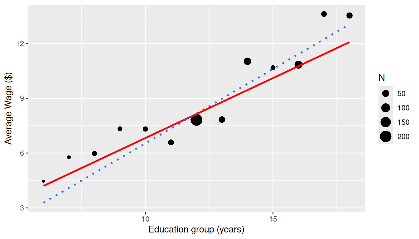
The standard deviations are much higher for the highly-educated groups, so that counteracts some of the effect of higher sample sizes.
30.9 Running Example Bridge: Weighted Summaries for Seoul Bike Data
The Seoul bike data also show why grouped summaries need care. If we average demand within temperature bands, some groups represent many more hourly observations than others.
seoul_grouped = seoul_hourly |>
    mutate(temp_band = cut(temperature, breaks = c(-20, -10, 0, 10, 20, 30, 40),
        include.lowest = TRUE)) |>
    group_by(temp_band) |>
    summarise(avg_bike_count = mean(rented_bike_count), avg_temperature = mean(temperature),
        N = n(), .groups = "drop")

seoul_grouped
# A tibble: 6 × 4
temp_band avg_bike_count avg_temperature N
<fct> <dbl> <dbl> <int>
1 [-20,-10] 141. -12.7 228
2 (-10,0] 210. -4.19 1226
3 (0,10] 425. 5.04 2143
4 (10,20] 765. 15.3 2264
5 (20,30] 1120. 24.5 2387
6 (30,40] 1106. 33.0 512ggplot(seoul_grouped, aes(x = avg_temperature, y = avg_bike_count)) + geom_point(aes(size = N)) +
geom_smooth(method = "lm", se = FALSE, linetype = "dashed") + geom_smooth(method = "lm",
aes(weight = N), se = FALSE, colour = "red") + labs(x = "Average temperature within band",
y = "Average bike demand", title = "Aggregated groups with different support should not be treated equally")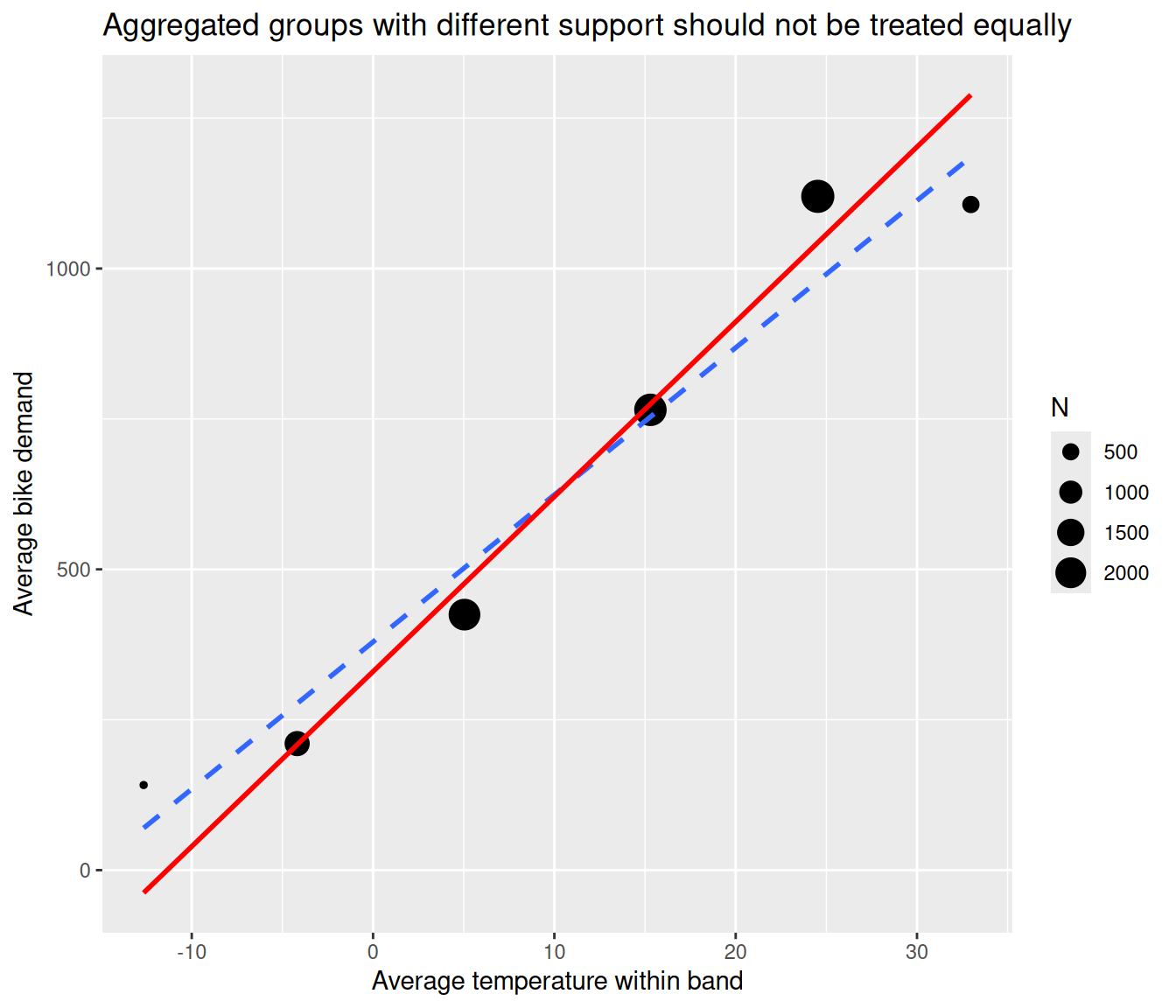
In this grouped view, weights represent how much information each summary point carries. That is a different issue from the time dependence we study later, but it is another reminder that the same applied dataset can raise several distinct regression questions.